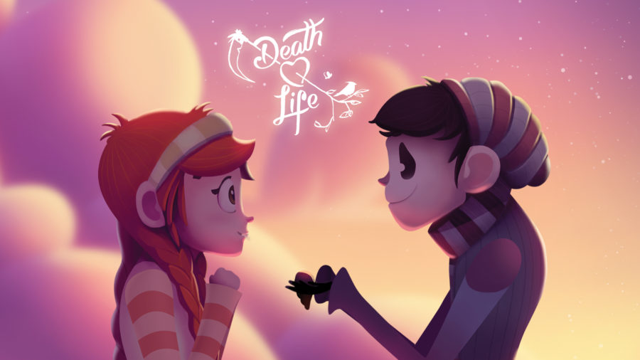
Over the course of two years, Jonathan Lacocque and I wrote, directed, produced, illustrated, animated, sound designed, and scored our short film, Death Loves Life. Here, we hope to give you a behind-the-scenes look, in two parts, into what it takes to create an animated film–from scripting to scoring.
 A few years ago, we read Life of Pi and were struck by one particular quote in the book:
“Life is so beautiful that death has fallen in love with it, a jealous, possessive love that grabs at what it can. But life leaps over oblivion lightly, losing only a thing or two of no importance, and gloom is but the passing shadow of a cloud…”
―Yann Martel, Life of Pi
The personification of death and his envious desire for life intrigued us. From this passage, we were inspired to write a short film, with the hope that we could find a fun and playful way to explore such a heavy topic in under four minutes of screen time. Why so short? We knew we wanted to animate the short and would be financing the endeavor ourselves. To keep the budget reasonable, four minutes was the maximum we could afford to invest.
After outlining the story with Jonathan over stout coffee and buttery toast, I forged ahead by writing a short script that embraced a young but forbidden love between a boy named Death and a girl named Life. Death and Life collide in perfect opposition to one another, and the script is interspersed with semi-dark comedic moments.
Death is an awkward, stiff character, who is enthralled by Life’s vivacity and innocence. In his attempts to befriend her, Death missteps at every encounter with Life. Meanwhile, Life is an airy, organic, and sunny character that lives in every moment fully.
We chose to exclude dialogue from the film. We wanted to keep both characters somewhat pure–we wanted viewers to emotionally experience the Life and Death through their actions, their environment, and the music.
Although the subtext is rather foreboding, this film is meant to be fun and light-hearted. It’s a cartoon and plays off of that medium purposefully. We even chose illustrator extraordinaire, Henrique Lira with the express wishes to give the piece more warmth. We first noticed his work on Vimeo.
Here’s just one example of Lira’s artistic talent:
Henrique Lira’s Mr. Drake illustration
ILLUSTRATION: CHARACTER DESIGN
Upon completing the script, we sent it to Lira and he loved it! So, we outlined a schedule and got started. Because character design directly informs the design and illustration of every scene and prop, Lira started with the characters: Death, Life, and Birdie. Lira’s process for illustrating characters is fluid and fruitful. First, he created several silhouettes and asked us to select three.
Silhouettes of “Death”
For Death, we didn’t want him to be too imposing or scary, but rather gangly and sweet like many of the characters you might find in a Tim Burton film. From the silhouettes Lira sent, we selected A4, B6, and C5. Along with these selections, we asked Lira to give Death a more compact, shorter sickle that could hang from his back. Lira added slightly more detail to each sketch and subtle revisions followed.
Three sketches for Birdie
For Birdie, a secondary role in the film, we wanted to keep the design simple. We didn’t want an exotic bird that would distract from our main characters, and we wanted to keep the bird realistic. It would have been easy to push the characters, including the bird, to a more fantastical level, but we aimed to find a balance between semi-realistic and vibrant. We whittled down the options to the three birds depicted above and chose to pursue A as Birdie.
For the character Life, we wanted her to exude a purity and innocence while reflecting the natural environment around her. Life’s character embodies elements of mother nature, so she needed to feel more organic and colorful. Life’s dress, for example, is made of flower petals, a leaf charm hangs around her neck, and her long, red braids swing down to her waist.
Life Drawn
Life’s Silhouette
Life’s Skeleton
Next, we considered the color. In painting the characters, we wanted to balance natural, earthy tones with vibrancy for Life; and we wanted more subdued blues, purples, and grays for Death. Here’s a process video that depicts Lira painting Death.
Our final cast:
Birdie
Life
Death
ILLUSTRATION: ENVIRONMENTS
Once the character illustration and painting were completed, it was time to set the stage and create environments or scenes these characters would live in. During each stage, like any film, the script changed in some ways. The development of the characters told us new things about the story, which influenced the environments. For example, as Lira designed the environments, he decided that the journey through each scene should reflect the seasons (Spring, Summer, Fall, and Winter). Beginning in Spring and Summer and ending in Fall and Winter, each act of the script is reflected in its corresponding season. This fit perfectly with our story and gave the acts more meaning. Not to mention, it allowed us to play with time–making it so that the four-minute story took place over a longer period of time.
Spring Thumbnails
Fall
Winter
Here’s a fun process video of the illustration process.
ILLUSTRATION: STORYBOARDING
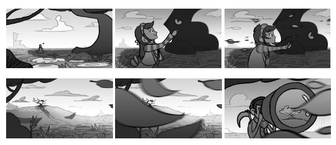
Storyboarding is an essential part of any video, but we were especially excited to see our film develop beyond the individual illustrations. During this process, the story is further defined and discovered. One script change that developed during this phase was a transition from Life’s introduction to the scene where we introduce Death. We chose to follow leaves blowing in the wind across the frame to make this transition subtle and dynamic rather than cutting directly to Death.
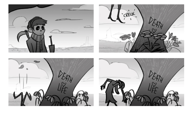
As the script outlines, we introduce Death perched in a tree and peering at Life through a spyglass. Suddenly, he loses his footing, falls out of the tree, breaks his neck, and kills the flowers below the tree with his fall. This playful, but morbid introduction, sets the tone for Death’s character, and it allowed us to display the film’s title cleverly carved into the tree’s trunk.

While boarding and developing the illustrations, Lira created a new character: Death’s sickle. In our original script, Death carried an inanimate sickle. As Lira illustrated Death, he felt that a bird-like sickle would allow us to add some comic relief to Death’s character. We decided the sickle’s responses should reflect how the audience may feel or respond to his actions.
For example, as Death tries to woo Life, the sickle is shocked and dismayed by his actions, which gives the audience a license to feel more comfortable with their own reactions to Death’s mistakes. The hope is that this character will help us laugh at Death’s unsuccessful attempts to win Life’s love and approval. A small character, but one of our favorites now!
COLOR SCRIPT
With storyboards complete, it was time to work on the color script. A color script gives directors an opportunity to review and map out the lighting, emotion, and color of a film. You see your entire animated film at a glance. Every Pixar film, for example, has a color script. Here is the color script from Up, created by the talented artist Lou Romano:
**If you haven’t seen Up yet, this color script has SPOILERS**
Up
There is an interesting article in Slash Film that gives the following description of Up’s color script:
“Click on the image above to enlarge. You will notice that the beginning of the film is heavily saturated. When Ellie enters Carl’s life, she brings much-needed color to the frame. When Ellie dies, Carl’s life again becomes more mundane and colorless. But the color returns, as with the memory of Ellie and her sense of Adventure, when Carl begins his journey with Russell. Each new character brings a new level of color and brightness. Also, notice how the scenes of adventure are bright, and the scenes of danger get dark.”
We set a goal to go through all four seasons in Death Loves Life. As you will see, we move from bright, vibrant, and warm colors to dark and arid gradually.
**If you haven’t seen Death Loves Life yet, this color script has SPOILERS**
BOARD-O-MATIC
In the meantime, we spoke with The License Lab, a music licensing company that we often work with for our commercial and corporate projects. They were interested in collaborating on our short film and offered their library of music for use in the film. After reviewing many tracks from their site, we chose four.
With our music selected and the boards and color script completed, we created an early board-o-matic with initial sound design by Shawn Wilson. The hope was to push the board-o-matic as far as possible to ensure we had the timing of the music and sound design right so that the animation would require fewer timing changes. Watch it here.

