Google announced a new font family in October with a surprising lack of fanfare. Despite a populace seemingly obsessed with design – one which believes we can design our way out of every problem – this announcement went largely unnoticed. And yet it has spectacular implications for writers and publishers all over the world.
In brief: Google has been working for the past six years with a design group called Monotype. Together, they’ve come up with a stylistically unified font family called Noto that covers all the language elements of Unicode. This means it is now possible to textually represent almost all of the major written languages of the world, plus a large number of dead or dying ones.
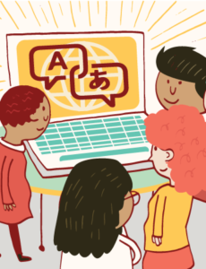
‘It will be a way to say, look, this is how we are the same. This is what unites us.’ (Illustration by Josh Quick)
This has enormous implications. Most of the world’s population speaks at least two languages, and frequently move between them in both spoken and written forms. If you speak a common language, like Spanish or English, it is already supported in all major font families. But for uncommon languages, or languages that are hard to render into type, it has meant downloading specialised font packs, moving between fonts, drawing images in paint programs, or latinising.
Even languages that are widely spoken may be hard to render, forcing speakers to use similar-but-not-quite-the-same languages to write to one another. (For more about this, check out Ali Eteraz’s article, ‘The Death of the Urdu Script.’) And yet the only place I found genuine excitement about this new font was on a linguistics Reddit thread:
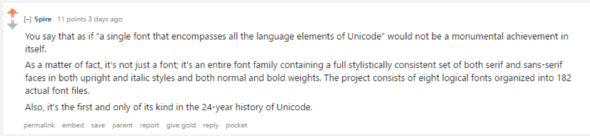
![]()
Personally, I believe this innovation is going to be genuinely game-changing for some publishers. Previously, to display an Urdu and English text side-by-side, you had to make a design choice about which fonts complemented each other. With a universal font, you can have a more stylistically consistent design or deliberately use distinct fonts to highlight difference.
You know those “Welcome” posters that come in different languages that you find at the entrance to primary schools and family health centers? They always look a bit Web 1.0, don’t they? Like maybe the secretary’s kid did them in Paint? That’s because they’re all in different fonts! They are literally in different fonts in order to be able to show Arabic alongside Korean.
Okay, maybe this is not such a big deal for those in the ink trade who can afford to develop a whole new font for a publication. But for online publications, it can be huge. This is Google. This is not some specialty font made by an obscure linguist. This is a pan-language font. It will be on all Android devices and most browsers. It means that for the first time, you could have several different languages on your webpage without it looking ghastly.
I volunteer at Structo, a UK-based literary magazine that is particularly interested in works in translation. I can really see how this could benefit us. I look forward to lining up Sanskrit texts next to their English translations in a unifying, rather than differentiating, design. It will be a way to say, look, this is how we are the same. This is what unites us. It’s the whole point of translation, after all. Not to dwell on our differences, but to acknowledge our similarities. For publishers releasing translations of obscure texts, this means that side-by-side translations can be in the same font. And for some other scholars and speakers of really obscure texts, it can mean that their languages will be easily available on the internet for the first time ever.
Writers of historical fiction should also be excited. They will be able to include the ancient Irish script Ogham alongside modern Irish or English, without creating stylistic anomalies that disturb the reader’s eye. Writers can include Glagolitic or Balinese or Lydian, if their character happens to be a time-travelling international traveller. Basically, the entire world of written language has just been blasted open. Today’s it’s Google, but now that the hard work has been done (this is an open source font), other providers and fonts will follow.
I think we should care. And I definitely think we should do everything we can to demonstrate these languages in whatever way we can. And I look forward to seeing Glagolitic, Ogham, or Lydian on a computer screen very soon.
Note: The opinions expressed by guest bloggers at the Submittable blog are theirs alone and do not necessarily reflect the opinions of Submittable.
 Nat Newman is an Australian freelance writer whose interests include food security and innovation, science, toilets, and space. And space toilets. Nat is the newsletter editor for For Books’ Sake, which champions writing by women, and has also had short fiction published in several literary journals. She can too often be found @lividlili.